Creating New Elements
Contents
- 1 Elements Explained
- 2 The Relationship between Objects and Elements
- 2.1 Creating New Elements
- 2.1.1 Text Element Type
- 2.1.2 Number Element Type
- 2.1.3 Date Element Type
- 2.1.4 Date and time Element Type
- 2.1.5 Email Element Type
- 2.1.6 URL Element Type
- 2.1.7 Currency Element Type
- 2.1.8 Percentage Element Type
- 2.1.9 Long Text Element Type
- 2.1.10 Drop down Element Type
- 2.1.11 Boolean Element Type
- 2.1.12 Attachment Element Type
- 2.1.13 Image Element Type
- 2.1.14 Time Element Type
- 2.1.15 Multiselect Element Type
- 2.2 Using the Link to code library option
- 2.1 Creating New Elements
Elements Explained
An element could best be explained as an item on a page such as a text box, drop down, option box, or button. This is exactly what we create when we select create element.
Once an element has been created, this will need to be added to the screen layout.
Please see Modifying Screen Layouts for more information on
this.

The Relationship between Objects and Elements
The Subscribe-HR System is an object orientated system. Every page is an object.
If we were wanting to create a new page we would be creating a new object in the system.
An Element is an item on a page. Items are required to be linked to a page (otherwise known as an Object).
This is enforced by requiring that an Object be selected first before an Element can be created.
Example: If I want to create a new element and add this to the Employee Medical form, I would have to select Objects, locate the Object called Employee Medical and then select Elements.
Creating New Elements
- After logging into the Subscribe-HR portal, select the Development TAB.
- Select the Objects folder.
- Select the Object you wish to create the element on.
If you wish to create a new object please see the documentation Creating New Objects - Select the Elements sub folder.
- Select the create button.
- Enter the Element name in Title Case. This should be a name that you can easily identify what the element is. Example: Item Serial Number
- Select the Element Record Type. This defines what type of element will be used. This is explained below.
- Enter the Element label. this is the text that you wish to appear next to the element. Example: First Name:
- Check the Mandatory field if you wish to make this element a field that must be filled in before the record can be saved.
- Check the Not editable after the value is saved field if you do not want to be able to edit the value saved in the element. This is often used for creating unique identifiers in a record set.
- Check the Do not show on create form if you do not want this element to appear when you select the create button.
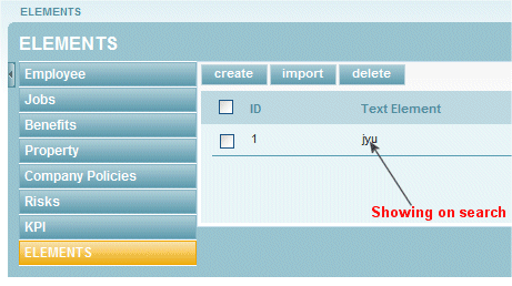
- Check the Display on search results if you want the data saved in this element to appear in the object search list
- Check the Use for searching if you want to be able to search on this data from the search list.
- Check the Use for predictive text searching if you want to enable predictive text search on this element.
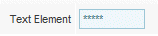
- Check the Mask Value if you wish to hide the actual value in the element. This will appear as ****
- Check the Display on Bread Crumbs if you wish for this elements saved value to appear in the breadcrumb trail
- Select the Groups that can edit this element. You are selecting your defined user groups as being able to edit the save values in this element.
- Select the Groups that can view this element. You are selecting your defined user groups as being able to see this element on a page.
This is a good feature and can be used for example: in scenarios where only HR Managers may only be able to edit and see comments on a page, self service users cannot see the comments. - Enter any element help
- Select the Save button.


Text Element Type
The text element type can record up to a maximum of 255 characters.
If you require more text you should consider using the Long Text element type.
Variables for this element
- Mask Value - masking of the value is performed by asterisk ***
- Minimum field length
- Maximum field length
- Field width(pixels
- Default value
Number Element Type
The number element can only store numeric values up to the maximum length of 255 characters.
Variables for this element
- Minimum field length
- Maximum field length
- Field width(pixels
- Decimal places
- Default value
Date Element Type
The date element can only store the date, in the local settings format.
By enabling the date picker you are enabling the ability to click in this
field and have the calendar show.
If you require Date and Time please use the Data and time element type.

Variables for this element
- Enable Date Picker
Date and time Element Type
The Date and time element can only store the date and time, in the local settings format.
By enabling the date picker you are enabling the ability to click in this
field and have the calendar show. The calendar cannot select the time.
Variables for this element
- Enable Date Picker
- Field Width (pixels)
Email Element Type
The Email element can store alpha and numeric values however has validation to check if this is a valid email address. The validation checks for @ and .
Variables for this element
- Minimum field length
- Maximum field length
- Field Width (pixels)
- Default value
URL Element Type
The URL element can store alpha and numeric values however has validation to check if this is a valid URL.
Variables for this element
- Minimum field length
- Maximum field length
- Field Width (pixels)
- Default value
Currency Element Type
The Currency element can store numeric values only to a maximum of 255 characters.
Variables for this element
- Minimum field length
- Maximum field length
- Field Width (pixels)
- Decimal places
- Default value
Percentage Element Type
The Percentage element can store numeric values only to a maximum of 255 characters.
Variables for this element
- Minimum field length
- Maximum field length
- Field Width (pixels)
- Decimal places
- Default value
Long Text Element Type
The Long text element can store alpha and numeric values.
By enabling the rich text editor you are switching on options to be able to format the text.

Variables for this element
- Minimum field length
- Maximum field length
- Field Width (pixels)
- Decimal places
- Default value
Drop down Element Type
The Drop down element type requires to be linked to a code library.
This is where the drop down will get its values from. See the Adding Data to the Code Library for more information.
Linking to the code library
After the Drop down element is created check the Link to code library checkbox, this will display a drop down called Code library entry, select from the drop down the desired code library.
Variables for this element
- Link to code library
- Code library entry
- Field Width (pixels)
- Field height (pixels)
- Default value
Boolean Element Type
The Boolean element type is a YES / NO or 0 / 1 option.
Booleans have the option of being a check box which when checked = true and unchecked = false
Booleans can also be a drop down, however this is not configurable and you only have the choice of YES or NO
Variables for this element
- Boolean display type - Check box or Drop down
- Default value
Attachment Element Type
The Attachment element type allows the uploading of a single file to the server per record.
Variables for this element
- None
Image Element Type
The Image element type is a place holder for an image, this allows the uploading of a popular format of image, and for this to be displayed on screen.
The resized feature is handy to use especially when you need to control what the screen may look like if a large image was uploaded.

Variables for this element
- Resize Image
- Resized Width
- Resized Height
Time Element Type
The time element type only allows numeric characters, and stores the time only.
Variables for this element
- Default value
Multiselect Element Type
The Multiselect element type allows for selecting of multiple options. Multiselects need to be linked to the code library.

Variables for this element
- Link to code library
- Code Library entry
- Field width (pixels)
- Field height (pixels)
- Default value
Using the Link to code library option
The Link to code library option is available on the Drop down and Multiselect elements.
- Select the Link to code library option on the element
- A Code library entry drop down will appear
- Select the desired code library
